I really love the process of book cover art and working with my designer.
Until recently, that is.
I’ve worked with the same designer since I got the rights back to my Mystery Writer’s series. We decided we liked the idea of the chair on the cover of FICTION CAN BE MURDER which the original publisher had used, so we revamped that theme, using a different chair for each cover.
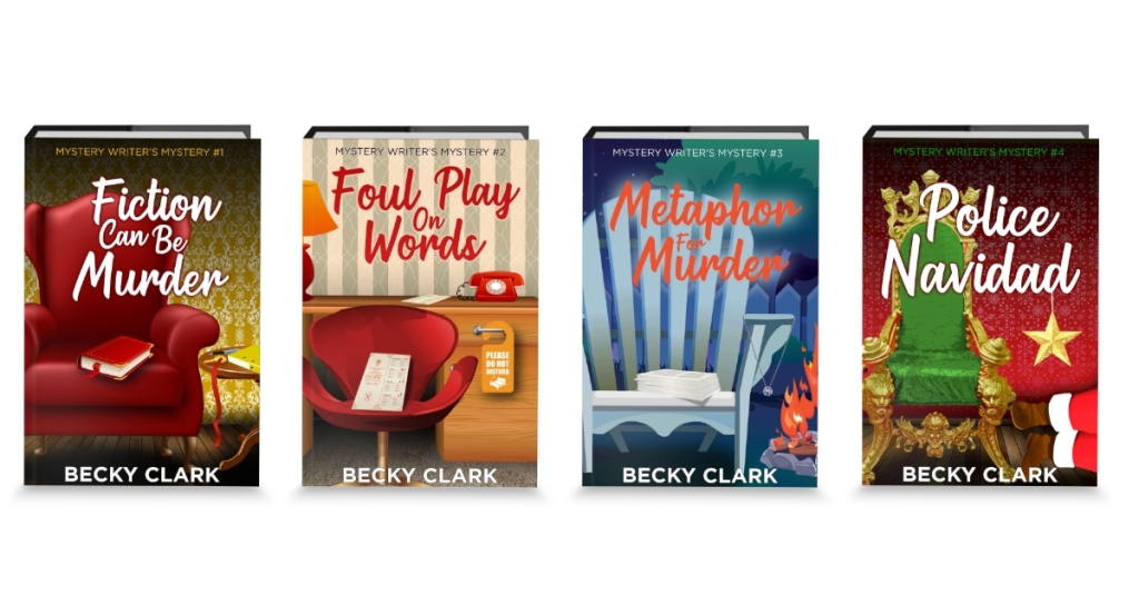
My sleuth Charlee Russo in the Mystery Writer’s series is a—surprise!—mystery writer so a cozy reading chair made sense. FOUL PLAY ON WORDS takes place at a writers’ conference in a hotel in Portland, so that’s the chair on the cover. A pivotal scene in METAPHOR FOR MURDER takes place around an outdoor firepit, so the Adirondack chair is perfect. And a Christmas play is the catalyst in POLICE NAVIDAD, so Santa’s throne is the obvious choice there.
My new soon-to-be-out Sugar Mill Marketplace series was a bit harder, but after a few stabs, he and I got something we both loved.
To refresh your memory, this will be a 15-book series, essentially five trilogies set in the same place with a huge cast of characters. The Marketplace is home to a bookstore, bakery, cheese shop, photo studio, and chocolate shop—and others, but these are the core businesses.
I wanted something other than the cartoony covers, maybe something a bit avant garde, at least in the world of cozies. Each trilogy had to be tied together, but at a glance, I wanted all fifteen books to be obviously part of the bigger series.
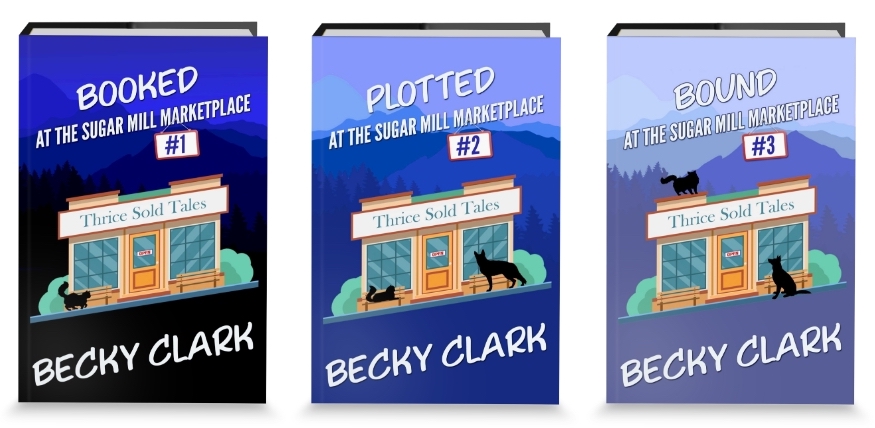
Here, the first three books center on Dena Russo and her used book store. I gave her the color blue, which you can see gets lighter as her trilogy goes along.
The bakery trilogy will be pink (probably), with a different storefront and the name of the bakery, and the cat and dog silhouettes in different positions. Same with the cheese shop, the photo studio, and the chocolate shop. I haven’t finalized their colors, but I want them to all look good lined up next to each other, nothing jarringly out of place. A lovely rainbow of book covers.
But before I could pull the trigger on the first cover, I had to make sure all fifteen would work. All the titles are one word and have to do with both the shop and the crime in the book. The three bakery books are BEATEN, FROSTED, and BURNED. The photo studio books are EXPOSED, SNAPPED, and MANIPULATED. The cheese books are CHEESED, GRILLED, and SMOKED. And the chocolate shop books are FUDGED, SUGARCOATED, and DROPPED. So I had to make my designer plop in the longest title and the shortest title to make sure they were all going to work in the template.
When we were happy with that, we found five stores we liked, and then fifteen different dogs and cats in different poses. Actually, we only needed fourteen German shepherds because Twist doesn’t show up until book #2.
But we finally got it all worked out … easy peasy, and relatively painless.
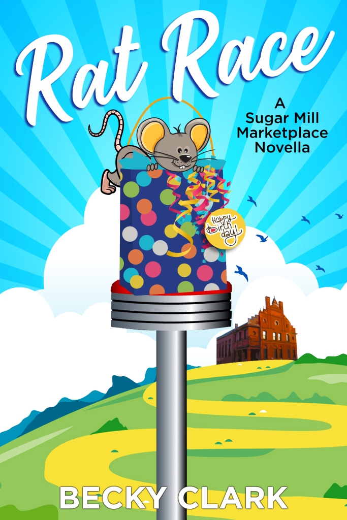
Then I had to decide how I wanted the cover of RAT RACE to look. It’s the bridge novella linking the two series together. I mentioned Charlee Russo in the Mystery Writer’s series. She lives in Denver and is the daughter of Dena Russo, who owns Thrice Sold Tales in the Marketplace series. RAT RACE stars both of them solving a mystery while Charlee is visiting Dena in Santa Fe, and Dena’s subsequent move to Sugar Springs, Colorado and opening the bookstore.
I had the brilliant idea of creating a cover that had elements of both series because technically, RAT RACE is book #5 of the Mystery Writer’s series and book #0 of the Marketplace series.
Unfortunately, I couldn’t think of how to pull this off. And neither could my designer.
Here’s a tiny sampling of our efforts …
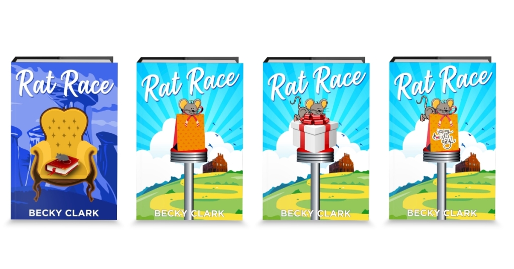
You can see the first try was horrendous. We tried combining the chair with a weird Santa Fe background. Nope.
Then I sent him the historical building I was kinda-sorta basing my Marketplace on. Okay … maybe. We used the font from the Mystery Writer’s series and the tilt of the Marketplace series. There are three important things in the novella: a diner, a birthday gift, and a rat. The diner stool hearkens to the chair on the covers of the Mystery Writer’s books and the road shows the Marketplace is in a different place from the diner, so that’s cool, but that gift bag looks weird. The box looks even weirder. Not entirely happy with that rat hanging off the edge, and can we do something to make it look like a birthday gift?
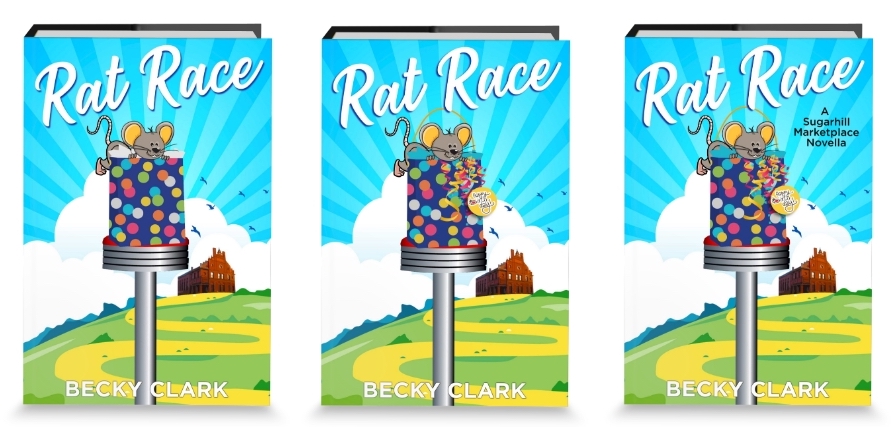
I sent some screenshots of real-life gifts bags to my designer that I thought looked particularly adult-gift-bag-worthy, so he created a festive polka dotted one. But I couldn’t find a rat I liked better. The white tissue paper looks like part of the clouds, and can we add some curling ribbon and a “happy birthday” tag? Oops, forgot the subtitle. Oops the subtitle is wrong. Oops, the subtitle is still wrong.
But finally, after a barrage of emails, designs, ideas, suggestions, screenshots, and a few tears on my part (and maybe his), we got it right.
Or as close as I’m going to get!
The RAT RACE process was so frustrating because it’s the first cover where I had no idea how I wanted it to look. Zero, zip, zilch. And it’s only a 99¢ novella … just 120 pages! How can it be so hard??
It’s finally out to my Review Crew, and the first three in the series will be released in the next few months.
Whew!
My fragile ego can’t accept criticism of my covers at the moment—mainly because I already paid for them—but I will accept gushing praise, true and heartfelt or not. I’ve got to admit I don’t care much about book covers, as long as they convey a sense of the story, a hint of the genre. I don’t know if that makes it easier or harder to design them, though. But I am curious … how important are covers to you when choosing a book? If it’s an unknown author to you, is the cover more important than if you aren’t wild about a cover from an author you already know you like? Do you buy books simply because of the cover, or conversely, refuse to pick one up and explore further if you hate the cover?
10 thoughts on “Cover Chaos”
The cover does catch my eye first. Then, I read two pages of its first chapter.
I love the colours you have chosen for all of your book covers.
Thanks, Sabina! It’s funny you mention the first two pages because I often open a book to the middle and check out a page or two there. I know how hard authors work on their beginnings, so I want to know if they sustained it. But maybe that’s just me! LOL
Cover is what usually draws me to a book. Title and synopsis on the back is next.
What if you only like 2 out of 3 of those things? Or only 1?
The cover of a book makes me want to read it and so far you are hitting it out of the park.
Ohmygosh, Donna! Thank you so much!
A cover will catch my eye, and then I turn it over to read the summary. This is what ultimately helps me to decide if it’s something I want to get lost in. Maybe the cover is like the book’s wingman 😉
LOL, Mishelle! I love that. I mean, we do so often begin long relationships with a book or a series, right?
Title -Cover- Author . They attract me . Then I read a couple of random pages . As an artist I like artsy covers . I’m also a less is more girl , I want that title to jump , not get lost . The art should reflect the theme of the story , fun , mysterious , scary , or sweet if it’s just a gentle little story about characters . Just my opinion , everyone’s got one . Thank you so much for the work you do as a writer. I enjoy your newsletters thanks for giving us perks into your process .
Thanks so much, Monica, and I’m so sorry for the tardy response. Sometimes my blog tries to ghost me.
I love hearing your thoughts! I absolutely agree about covers matching the story. Can you imagine picking up a book with a fun cartoony cover and then have it be a scary horror story? Egads.